Cinkciarz – Design System Piano
Precision, rhythm, clarity – the Piano way
Growth stage
B2C / B2B
Company size
250+
Industry
Finance / Fintech
Market
Mainly Poland 80%
(partly US, Germany, other)
Product
Mobile App, Web App, WWW
Precision, rhythm, clarity – the Piano way
Growth stage
B2C / B2B
Company size
250+
Industry
Finance / Fintech
Market
Mainly Poland 80%
(partly US, Germany, other)
Product
Mobile App, Web App, WWW
Long story short
To fix the fragmentation across Cinkciarz’s products, we needed more than just a redesign – we needed a shared language.
My role
I led the creation of a Design System from scratch for Android, iOS, and Web, aligning all platforms visually and functionally. It helped unify the user experience, speed up development, and improve collaboration between designers and developers. This system became the foundation for scaling the product more efficiently – and consistently.
Problem
Fragmented UI, slow delivery, and inconsistent implementation.
Designers spent too much time aligning styles manually. Developers rebuilt the same patterns with slight differences. Launching a new feature meant redesigning what should already be standard.
There was no single source of truth, no shared design language, and no efficient way to scale UI decisions.
Goal
Establish a shared foundation to ship faster, scale smarter, and collaborate better.
The mission was clear: unify the product experience and make the design-delivery workflow faster, more reliable, and easier to maintain – for all teams involved.
Key areas of focus:
- Create a design system from scratch to unify Android, iOS, and web experiences
- Implement design tokens in Figma for better theming, consistency, and future flexibility
- Introduce Dev Mode in Figma to improve communication and component handoff
- Define clear usage guidelines, documentation, and contribution rules
- Improve collaboration between product designers, engineers
- Reduce time-to-ship for new features through reusable components and clear design standards
We also adopted best practices like versioning, accessibility standards, naming conventions, and regular audits to ensure the system evolves with the product.
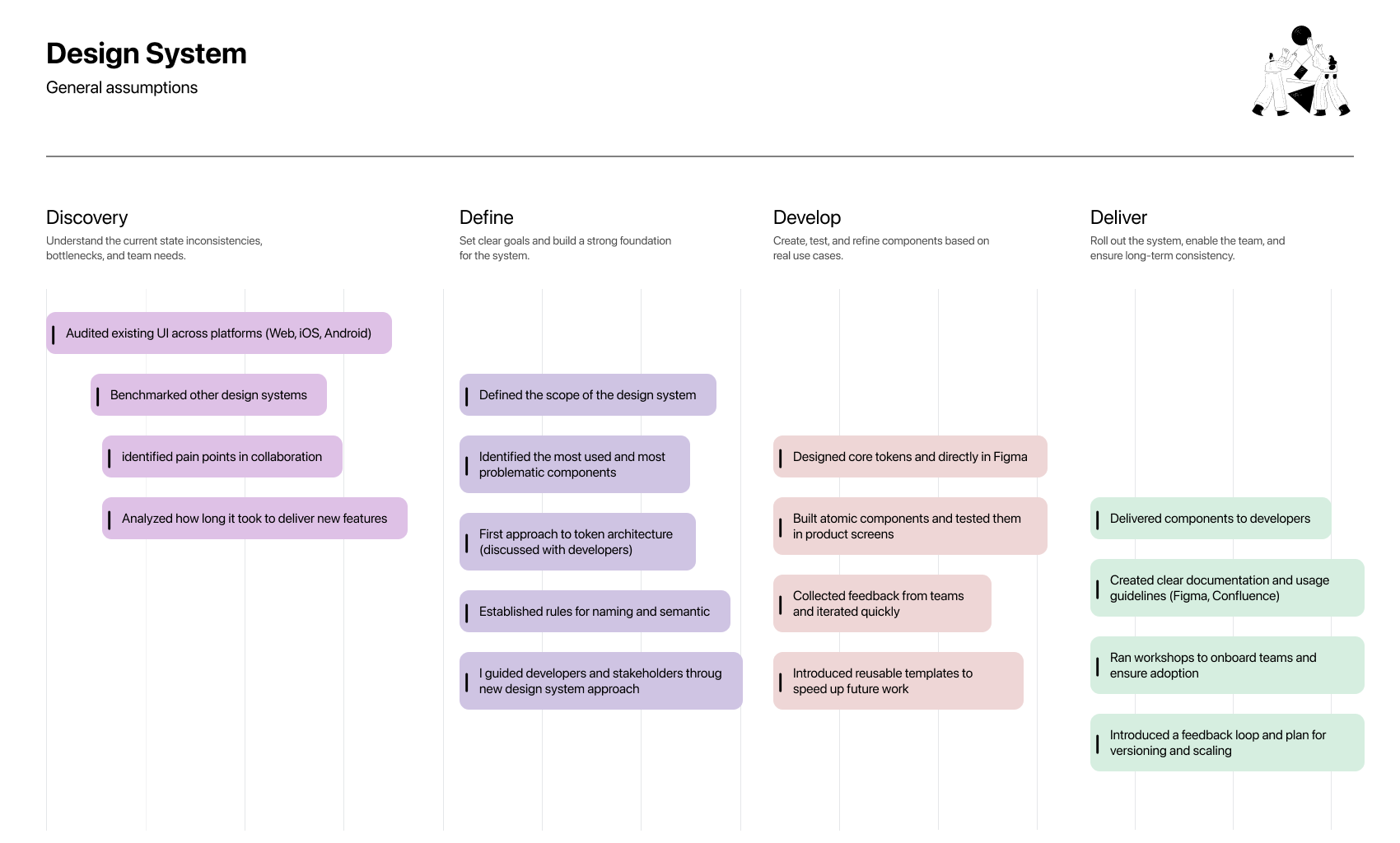
Design process
Discovery
I started by auditing all platforms (web, iOS, Android) to understand where inconsistencies and friction appeared. I also spoke with designers and developers to map internal workflows and delivery pain points.
Define
Based on the audit, I outlined a roadmap for the system — starting with tokens, core components, and shared styles. We agreed on naming conventions, principles
Develop
I created the first version of the design system in Figma, built around atomic principles and token logic. Early components were tested in real product contexts and refined with feedback from the team.
Deliver
To ensure adoption, I documented everything clearly, shared patterns, and held onboarding sessions with designers and devs. We also defined a contribution process to keep the system growing and evolving with the team’s needs.
New approach
Setting a new design direction by defining clear principles around consistency, scalability, and usability. This helped us test different approaches to the design system and choose solutions that worked best across platforms – making the experience smoother for users and easier to maintain for the team.
Most people saw Cinkciarz as just a currency exchange – we used our Design System to change that.
During discovery, I realized that design lacked the cohesion needed to reflect a modern fintech brand. While competitors like Wise or Revolut built strong narratives through consistent UI and UX, our products felt disconnected.
So we created a unified Design System – not just for aesthetics, but to build trust through clarity, consistency, and scalability. It became the foundation for transforming Cinkciarz from a functional tool into a recognizable, digital-first finance platform.

A single source of truth. Polish roots. Global standards.
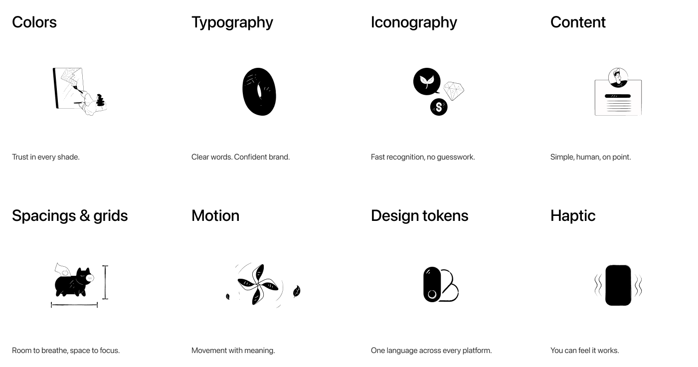
Design that speaks the same language
From motion to tokens — clear, consistent, and crafted to scale.
Accessibility

Built for everyone, by design.
Motion

Move with purpose.
Brand guidelines

One voice, every screen.
Documentation

If it’s not written, it doesn’t exist.
Foundations are the basics behind how Cinkciarz looks and feels – colors, text, spacing, motion, and more. They help us stay consistent, build faster, and make sure every product feels clear, modern, and trustworthy.
Foundations
Communication
Web
Mobile
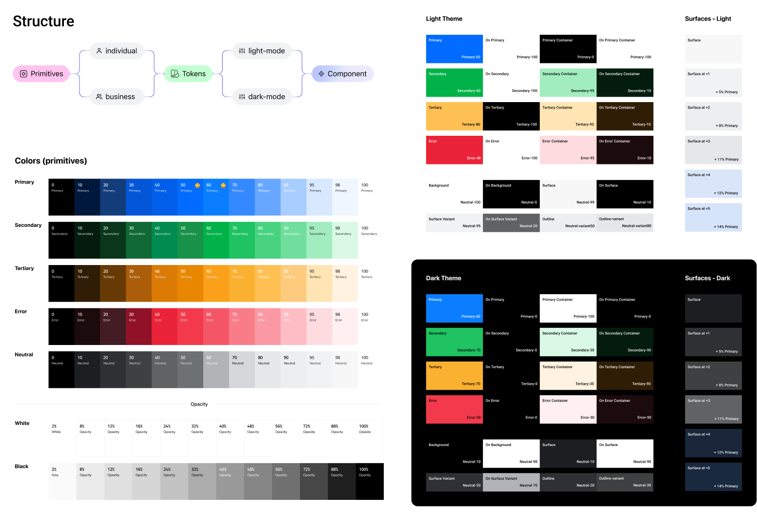
Color system
The Cinkciarz color system was built from scratch to fit the company’s unique needs. It’s based on primitives tailored for individual and business contexts, giving room for future expansion. These are mapped to semantic tokens optimized for both light and dark modes and assigned directly to components for consistency and flexibility across the UI.
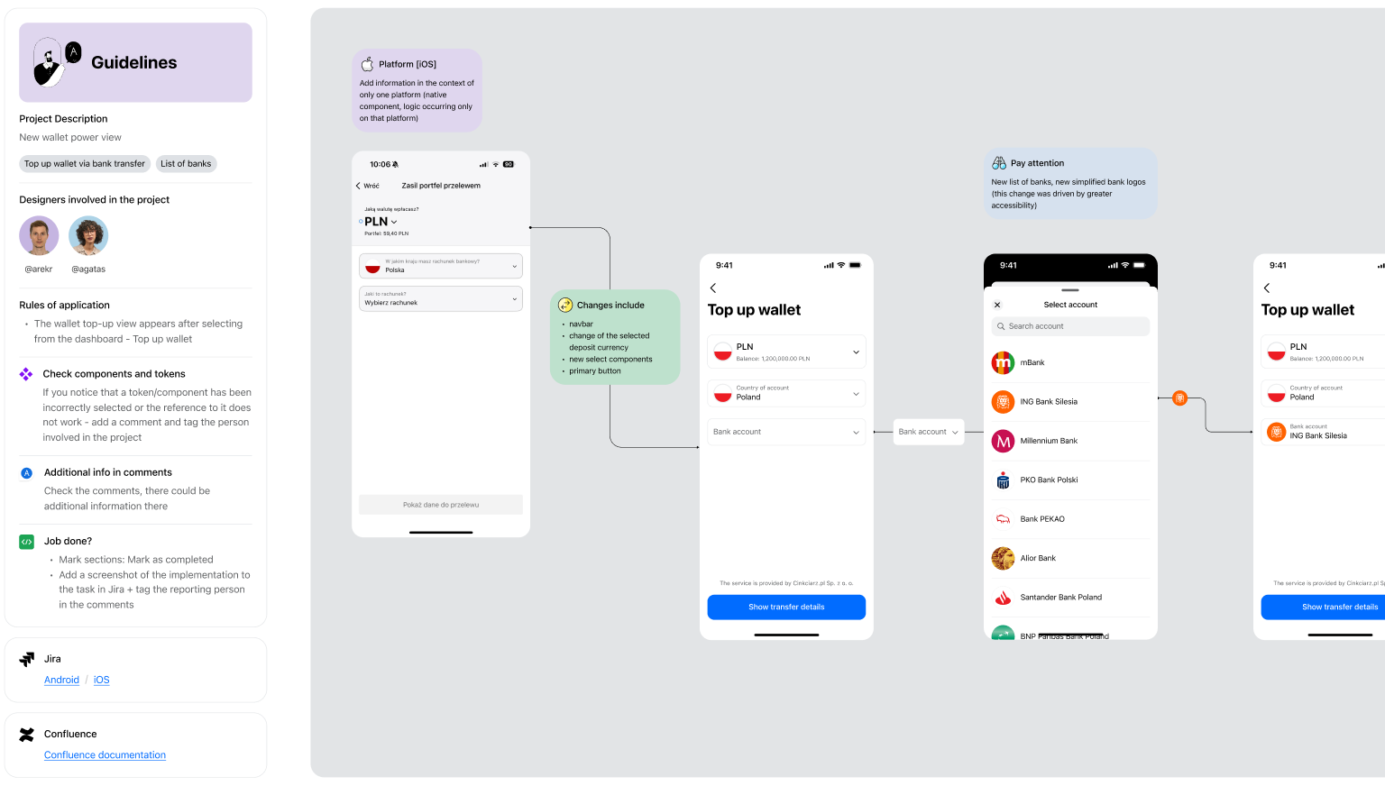
I’ve created clear guidelines for smoother project hand-offs, along with structured notes that explain the flow of changes and guide developers  through view updates.
Documentation
Components usage
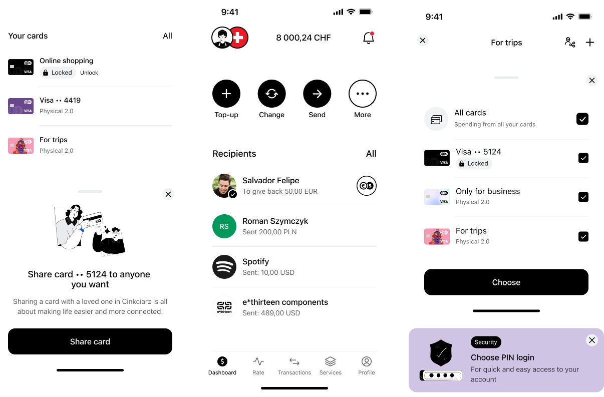
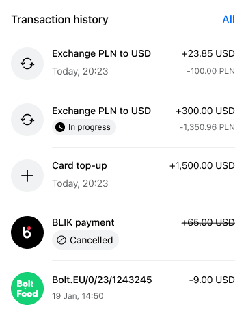
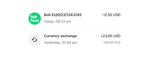
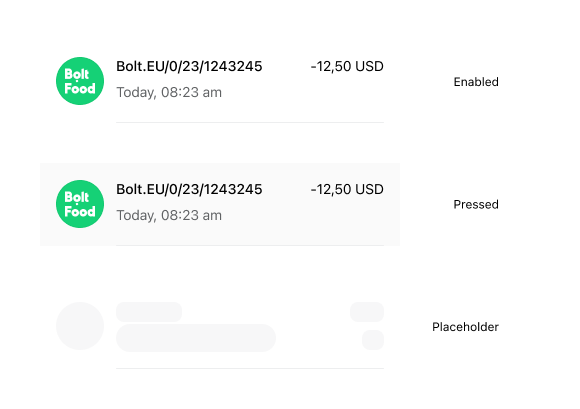
Transaction row
It shows the most important info at a glance: what the transaction was, how much, when it happened, and its current status. It’s designed to be clear and easy to scan, even in longer lists. The layout works well on both light and dark themes, and follows our design tokens for spacing, text styles, and colors.
Component usage

Platform -> Mobile
Device -> iOS
Hierarchy -> Atom
Transaction-row component is part of Molecule → List
This component can be found in transaction history or recent activity screens – always helping users quickly find what they’re looking for.
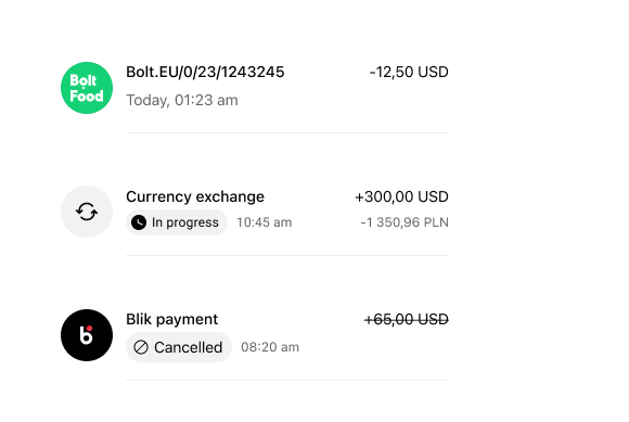
Transactions are split into internal (within Cinkciarz accounts) and external (to or from other banks or services), making it easier to track where your money goes.
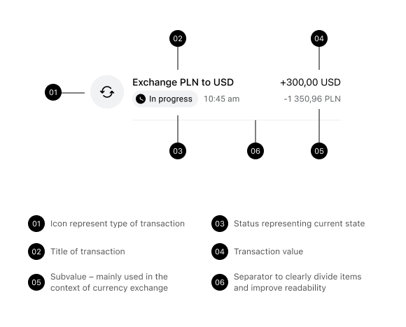
Anatomy
It includes an icon (merchant or category), a clear title (like the transaction name), the main value (amount), and a subvalue (e.g., exchange info or details).
Internal transactions
The main difference with internal transactions is the use of a neutral color, signaling that the action took place within the Cinkciarz app. It helps users quickly recognize and distinguish these transactions at a glance.
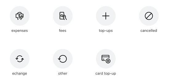
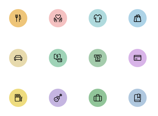
External transactions (categories)
External transactions use distinct colors and icons to clearly show what each transaction relates to – whether it’s a restaurant, withdrawal, or travel. If the merchant icon is not available, a default icon assigned to the transaction category is displayed instead. This visual system helps users instantly understand the type and purpose of each transaction.
External transactions (different types)
Merchant type – displays the merchant’s logo when available; otherwise, shows a default icon based on the transaction category. There’s also Blik, initials (clinet or company if logo is not provided) or avatar if client is your Cinkciarz buddy.

States
States and variants like enabled, pressed, or loading ensure components respond clearly to user interaction and system feedback.
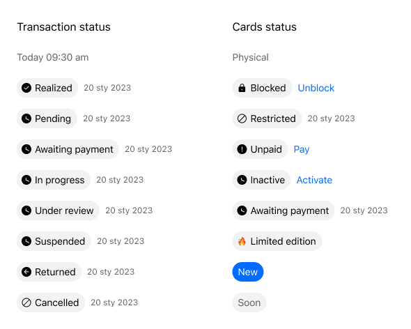
Transaction status
States and variants like enabled, pressed, or loading ensure components respond clearly to user interaction and system feedback.
Transaction and card statuses
Transaction statuses fall into three main types: completed (shown with just a date), in progress (like pending or awaiting, marked with a clock icon), and cancelled (clearly labeled to indicate the action didn’t go through).
Important
Statuses across different areas, like cards or payments, should stay cohesive. Using consistent patterns but allowing for variations like icons or action buttons (e.g. „Unblock card”) to reflect specific context.
Variables
Each component is assigned tokens exported to a JSON file and imported by developers across platforms. These tokens are integrated directly into GitLab for iOS and Android, and into Storybook for Web. This setup was designed to speed up implementation, improve consistency, and make it easier to maintain and update components efficiently across the entire design system.
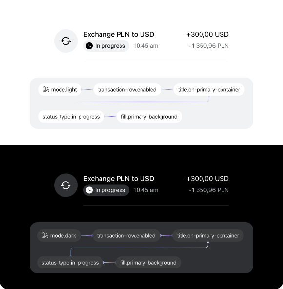
Token-powered design handoffs: where pixels meet code with less drama and more precision!
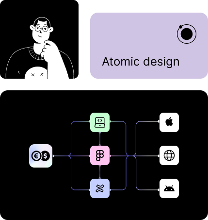
Atomic Design simplifies project handoff to developers by breaking down designs into reusable components like atoms, molecules, and organisms. Leveraging design tokens in Figma streamlines this process by ensuring consistent styling and easy updates across projects, making collaboration smoother and more efficient.

Summary and conclusions
The Cinkciarz Design System project was a foundational initiative to bring coherence, speed, and scalability to one of Poland’s most recognized fintech brand. It was built to support a shift from a fragmented experience to a unified, future-ready product ecosystem.
Design System Strategy
Defined a clear structure based on atomic design principles — from primitives and tokens to fully composable components.
Designed flexible foundations like color, typography, spacing, and elevation to support both individual and business contexts.
Introduced semantic tokens mapped to components and adapted for light and dark modes.
Created modular components optimized for real product use cases.
Established naming, documentation, and contribution rules for better cross-team adoption.
Implementation & Business Impact
Enabled faster development and more consistent UI across iOS, Android, and Web through JSON-exported tokens.
Reduced design and dev debt by centralizing decisions and removing duplication.
Allowed teams to focus on features, not rebuilding UI patterns from scratch.
Supported the brand shift toward “trusted Polish fintech” through visual clarity and system consistency.
Team & Process
Worked across UX, Dev, PM, QA, and Brand to ensure the system reflected both product realities and future goals.
Held regular syncs, audits, and check-ins to ensure adoption and validate structure.
Integrated feedback loops from internal teams and product squads.
Documented use cases, examples, and decisions to build a living system, not just a library.
Benefits for Product Teams
Shared language and tools across teams reduced back-and-forth and guesswork.
Tokens and components sped up implementation and minimized inconsistencies.
System flexibility allowed for faster scaling of new features and flows.
Created a single source of truth that empowered both designers and developers.
What we learned?
A design system is not just a library — it’s an infrastructure investment that requires ownership and long-term thinking.
Building from real product context leads to adoption. Teams need to see themselves in the system.
Trust in the product can be strengthened through visual consistency and UI clarity.
 journey
 system cinkciarz
  discovery