Cinkciarz Discovery
From insight to clarity – turning complexity into confidence.
Growth stage
B2C / B2B
Company size
250+
Industry
Finance / Fintech
Market
Mainly Poland 80%
(partly US, Germany, other)
Product
Website
From insight to clarity – turning complexity into confidence.
Growth stage
B2C / B2B
Company size
250+
Industry
Finance / Fintech
Market
Mainly Poland 80%
(partly US, Germany, other)
Product
Website
About project
The new navigation and information architecture was intended not only to improve the overall user experience but also to better support the company’s communication and business goals.
We explored new ways of presenting information on the website, aiming for a structure that not only organizes content effectively but also aligns with the brand’s updated communication strategy.
My role
In this project, I worked closely with the UX researcher to support the research process. I helped analyze previous findings and Google Analytics data, which helped us shape clear hypotheses. I joined user research sessions and also ran one of the usability tests myself. On the design side, I created the first concept and prototype, then improved and tweaked it with each new round of feedback.
Problem
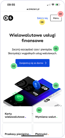
Cinkciarz has grown a lot in the last few years and kept stacking new financial products like Lego bricks, but the site layout never caught up.
There was a clear business need behind the project – we observed that users were struggling to fully understand and discover the range of services Cinkciarz offers. Many got lost within the site’s structure, skipped important sections, or didn’t clearly grasp the value proposition.
Goal
Our goal was to design a new navigation and clear information architecture to help users move through the site more easily and better understand the services.
The main objective was to identify and fix usability issues that users encountered while navigating the site. We focused on improving clarity, simplifying user flows, and making key services easier to find. Through research and testing, we aimed to build a smoother, more intuitive experience that supports both user needs and business goals.
Design process
Discovery
During discovery we took a deep dive into Cinkciarz’s current experience - auditing the UI/UX, scanning competitors, and mining desk‑research data, then distilled the findings into key hypotheses that shaped the next design moves.
Desk research • Audit UX / UI Competitors Analysis • Hypothesis • Research brief
Define
In the define phase, we turned discovery findings into clear problem statements, mapped key pain points, and created design hypotheses. This kept us focused on real issues before exploring solutions.
Research insight syntesis • Issue table • Mind map
Develop
In the define phase, we turned insights into clear problem statements, tracked usability issues, and outlined design hypotheses to stay focused on what mattered most.
Concepts / prototypes • Customer journey • RITE tests • Reports • Research synthesis
Deliver
In the final stage, we shared key research insights, mapped pain points, prioritized actions with a 2×2 matrix, and updated the design system -setting up smoother future work.
Data synthesis • Documentation • Design system
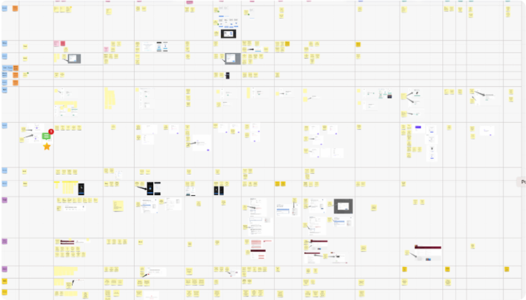
Iterations
The team
I teamed up with a UX researcher. Combining an interface designer’s perspective with research expertise allowed us to better understand real user needs, formulate more accurate hypotheses, and validate solutions more effectively.
Double diamond design process
We went through the full design process – from discovery and ideation, testing, all the way to delivery.
Stakeholders were partially involved throughout, with regular updates and condensed research reports shared along the way. This collaborative approach helped raise design awareness across the organization and made insights (e.g. in Dovetail) more visible and engaging for non-design teams.
The project also became an opportunity to foster a culture of collaboration, education, knowledge sharing, and collective learning – not just within the product team, but across the company.

01 Discovery
We explored, analyzed, and turned insights into smart design moves.
During discovery we took a deep dive into Cinkciarz’s current experience - auditing the UI/UX, scanning competitors, and mining desk‑research data, then distilled the findings into key hypotheses that shaped the next design moves.
The project also became an opportunity to foster a culture of collaboration, education, knowledge sharing, and collective learning – not just within the product team, but across the company.

Kickoff
We started the project with a couple of quick kickoff sessions and fast-paced workshops to get everyone aligned. It was a great way to set clear goals, share ideas, and figure out where to start.

Audit UX
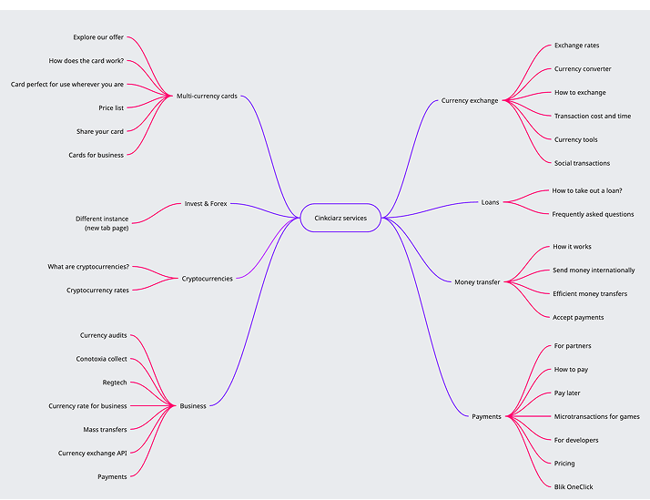
We mapped Cinkciarz’s current navigation,page hierarchy and information architecture into a mind map, giving the team a clear, visual snapshot of how every section connects

Audit UI
I conducted a UI audit focusing on consistency with the design system, typography, responsiveness, animations, and accessibility – which also tied closely into the visual layer.

Desk research
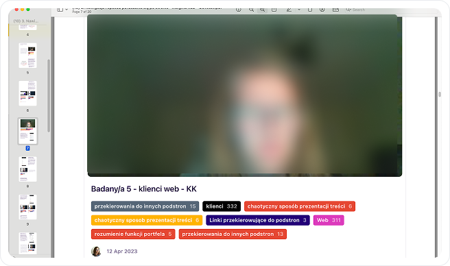
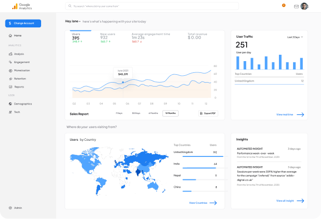
During discovery, we analyzed past research, session recordings, and Google Analytics to spot navigation patterns and pull key takeaways from earlier interviews.

Accesibility
We mapped Cinkciarz’s current navigation and page hierarchy into a mind map, giving the team a clear, visual snapshot of how every section connects

Competitors analysis
We analyzed competitors to understand how they structure information and navigation.

Hypothesis
Based on findings, we formed initial hypotheses to guide further design work.

Research brief
We aligned on a research brief with the team, outlining our goals and plan during a workshop
02 Define
In the define phase, we organized the findings from discovery into clear problem statements and mapped out key pain points.
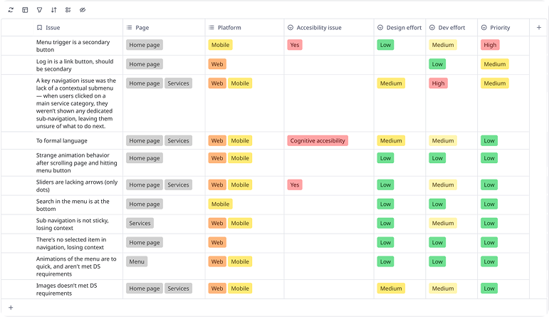
We created an issue table to track usability problems and drafted design hypotheses to guide the next steps. This helped us focus on what really mattered before jumping into solutions.
Issue table
We used an issue table to clearly define each UX/UI problem, assign it a priority and track progress across iterations in a structured way.
Mind map
We mapped Cinkciarz’s current navigation and page hierarchy into a mind map, giving the team a clear, visual snapshot of how every section connects.
Competitors analysis
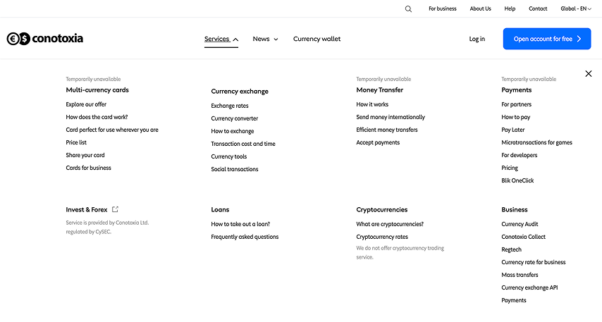
We analyzed competitors to understand how they structure information and navigation. When looking at financial platforms like Revolut, Wise, mBank, and PKO, we noticed a strong move toward simpler site structure and clearer separation between business and individual context.
Synthesis of data from previous studies
We built on insights from earlier research, including interviews, session recordings, and analytics. While some recommendations had already been implemented, many key issues remained — giving us a clear starting point for the next design phase.
Rainbow method
Insights
Google analytics (conversion)
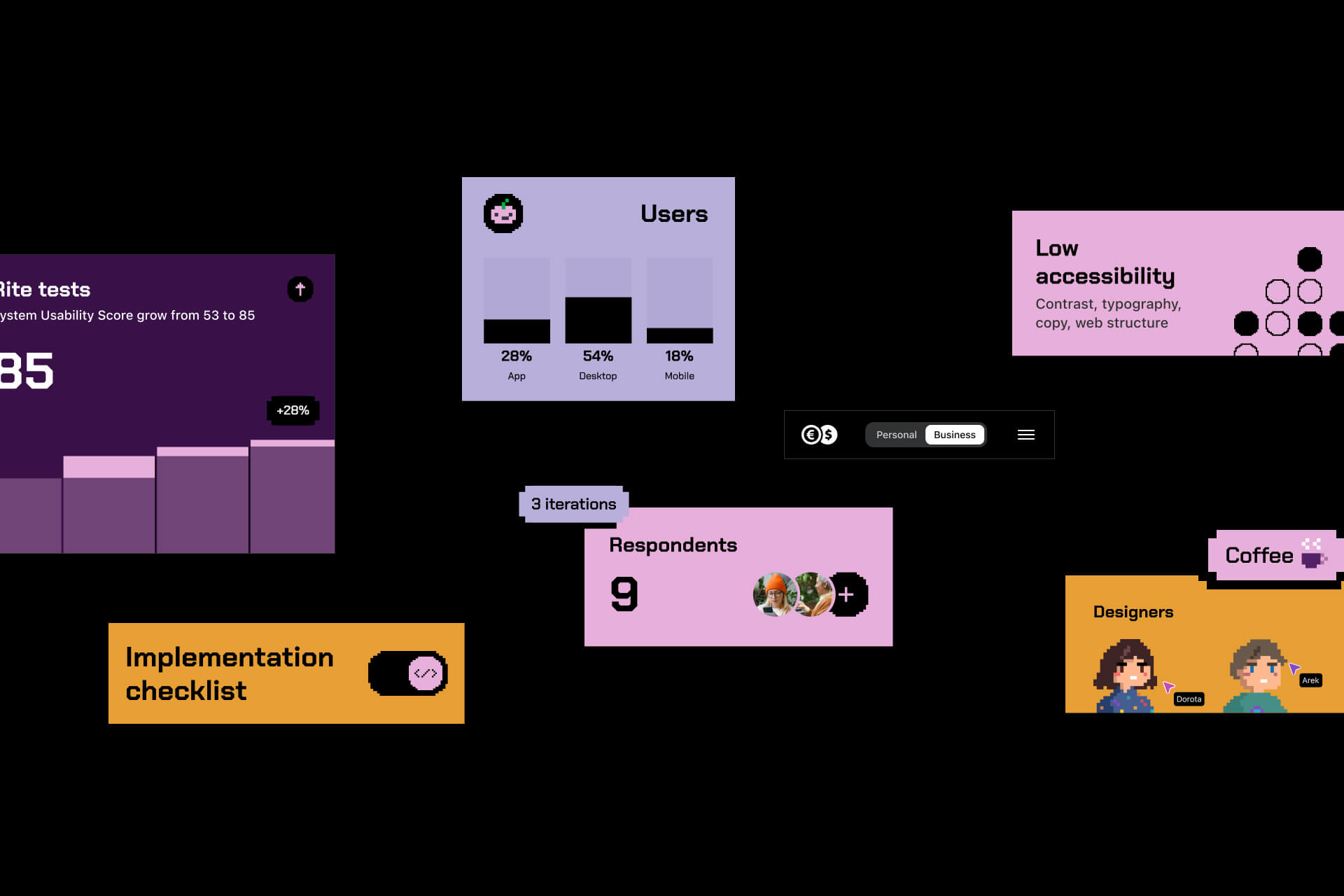
System Usability Score
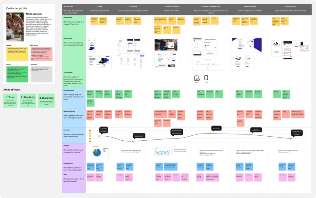
Customer Journey Map
Showing pain points, emotions, opportunities, help us with making hypothesis. The journey map was updated continuously throughout the project, especially after each round of usability testing, to reflect new insights and improvements in the user experience.
Prioritatization matrix
We started building the 2×2 prioritization matrix in the Define phase to map out ideas and usability issues based on their impact and effort. Rather than completing it all at once, we treated it as a living document — updating it continuously as new insights came in from testing and iteration. This ongoing approach helped us make better, more confident decisions at every stage, keeping the team focused on what really mattered.
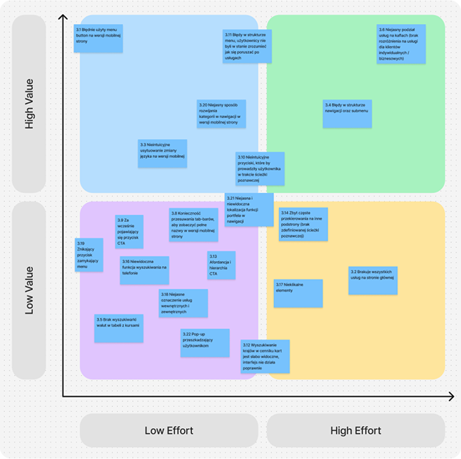
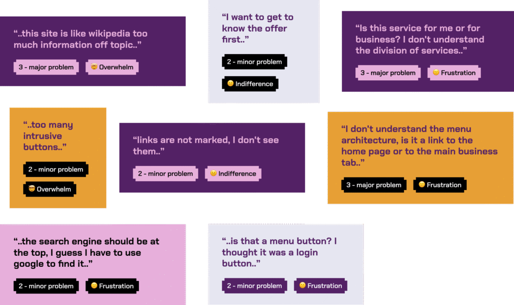
We based the severity labels on insights gathered during earlier research. Each usability issue was tagged using a heuristic scale that considered frequency, impact, and persistence. This helped us assign consistent labels such as:
- Indifference (Minor) – Low impact, easy to ignore or recover from
- Frustration (Major) – Caused delays or repeated confusion
- Overwhelm (Critical) – Blocked users from completing tasks
This labeling helped us prioritize what to fix first in the following iterations.
03 Develop
In the develop phase, we organized the findings from discovery into clear problem statements and mapped out key pain points.
We built on insights from earlier research, including interviews, session recordings, and analytics. While some recommendations had already been implemented, many key issues remained – giving us a clear starting point for the next design phase.
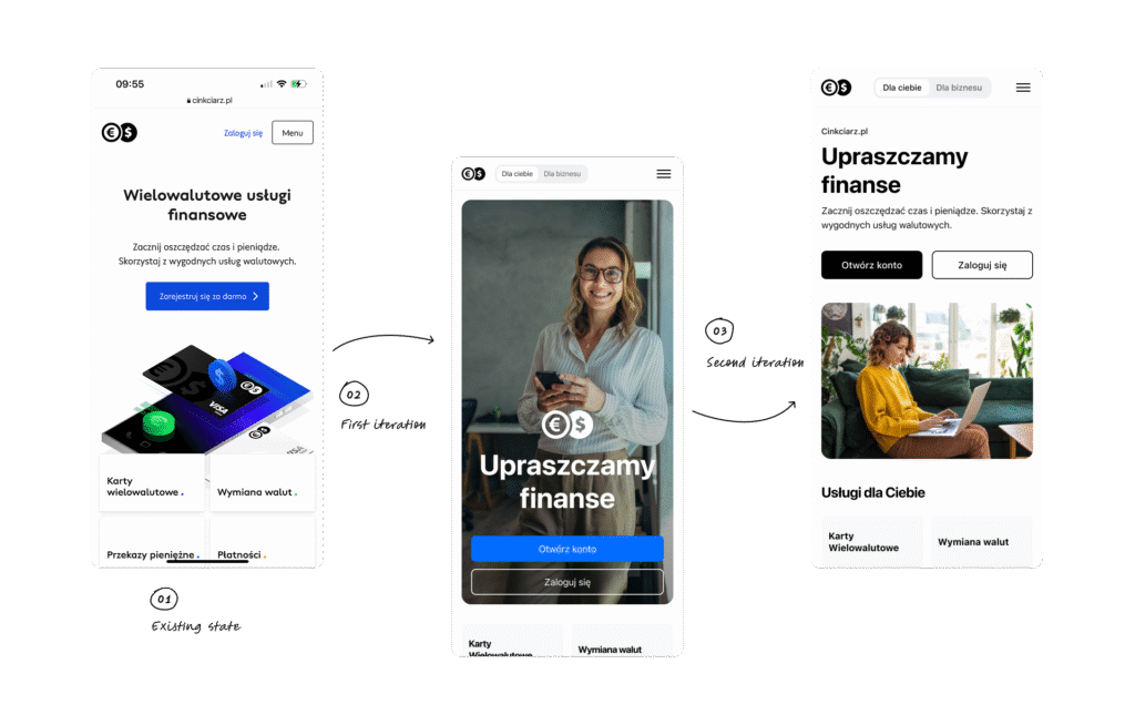
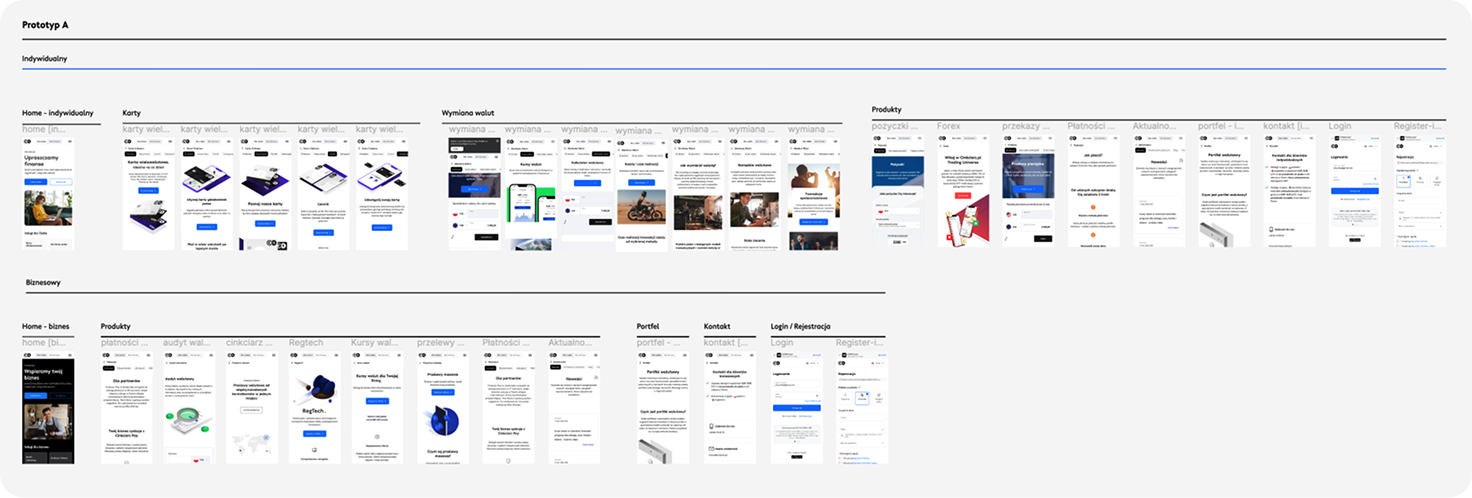
Previous interfaces

First concepts and iteration
RITE tests
After completing the earlier steps, analyzing data, forming hypotheses, designing the prototype concept, and preparing the test scenarios – we were ready to kick off the RITE testing sessions.
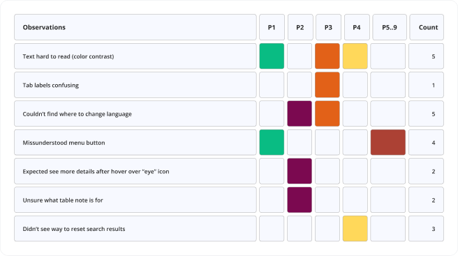
We invited 9 company employees to participate in the study (4 in the first iteration, 3 in the second, and 2 in the final one). We made sure the research sample was diverse in terms of technical skills. An important selection criterion was also minimal day-to-day interaction with the Cinkciarz.pl website, ensuring fresh perspectives.
Most participants were not part of the product team, which meant their knowledge of specific services was similar to that of our customers or potential customers.
01
iteration (RITE test)
Each research session included a researcher acting as the moderator and at least one observer (including the designer working on the solution). During the sessions with individual participants, observers took notes on user behaviors and comments, which we later analyzed together during workshop sessions.
Each research session consisted of 4 stages
- short introductory interview
- a task-based part
- summary questions
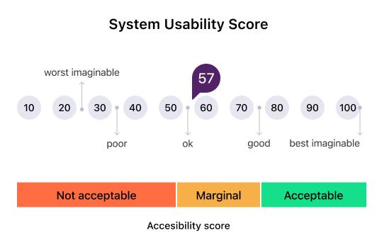
- filling in the SUS questionnaire

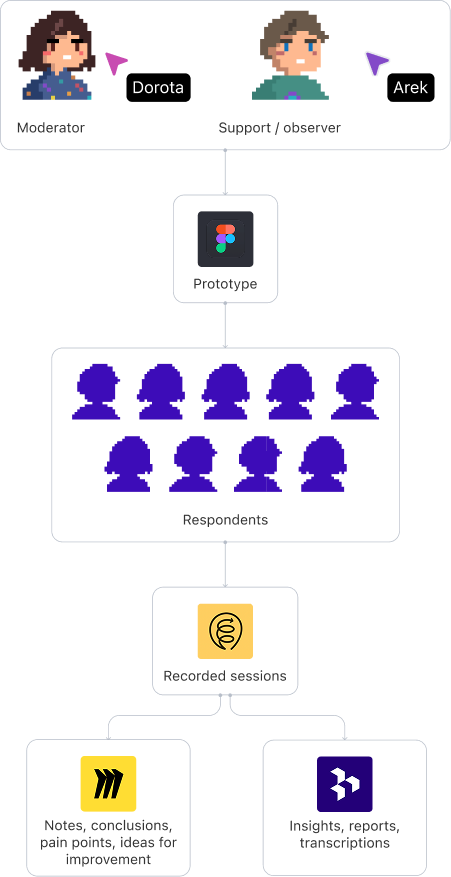
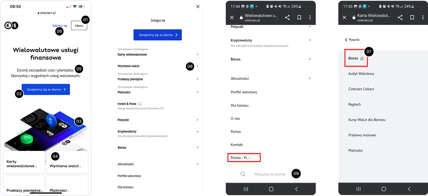
During the meeting, respondents were asked to perform the following tasks on the prototype:
- determining where the pages are located,
- checking the price of the physical multi-currency card,
- checking what the Cinkciarz Collect service is for,
- checking who the currency audit and money transfer services are dedicated to,
- finding the search engine,
- finding the language change option,
- finding the registration option.
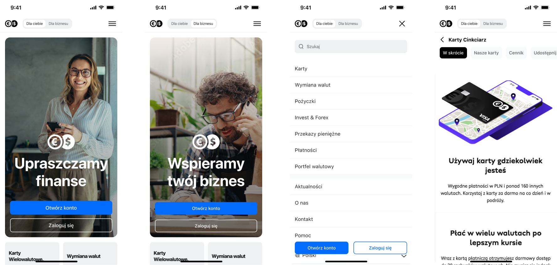
RITE – prototype
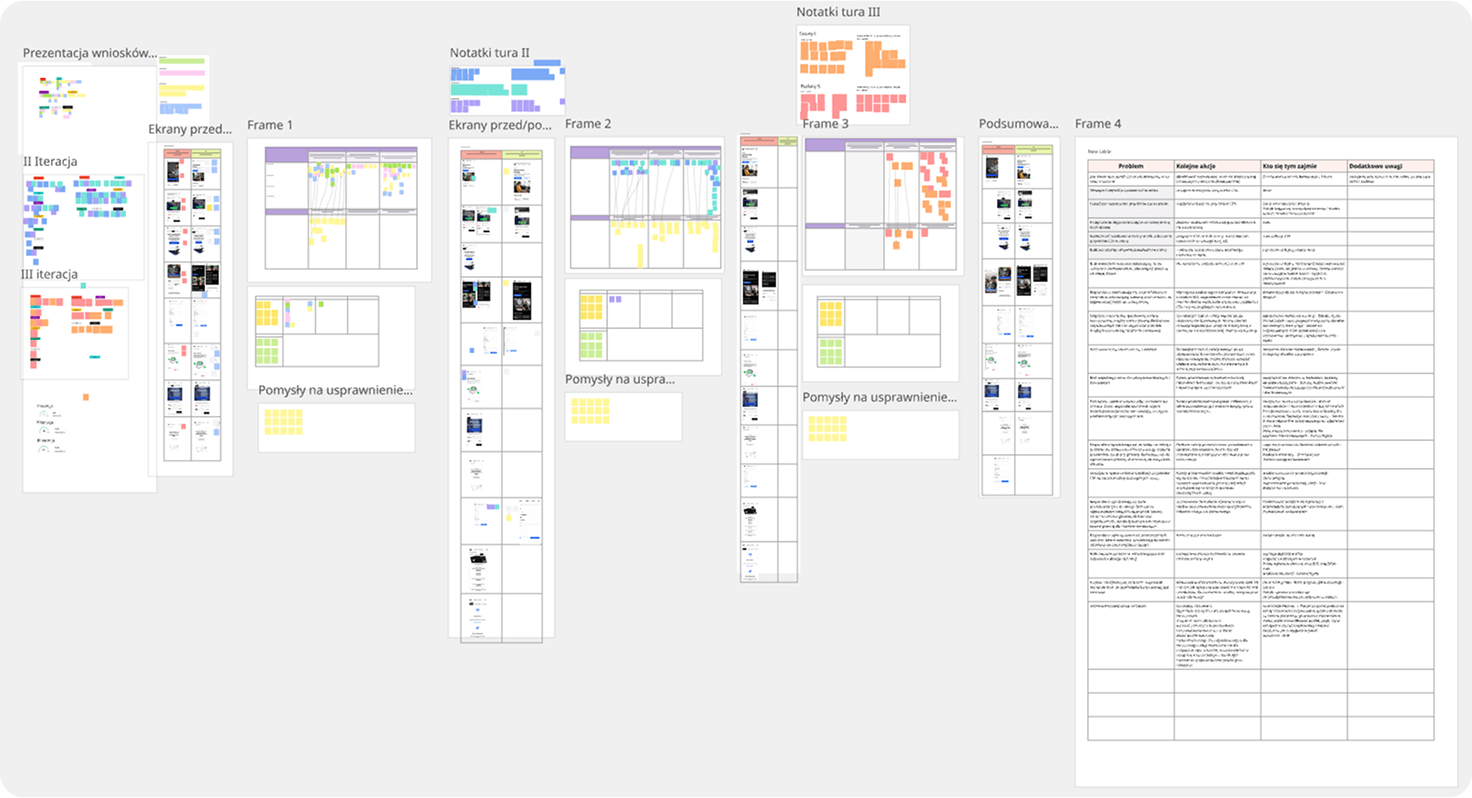
Miro (all iterations): Notes from test, conclusions, pain points, ideas for improvement
Summary
The first round of RITE testing was incredible — participants eagerly shared their experiences and emotions, and they quickly grasped how the new navigation worked. Our key hypotheses were confirmed much faster than we expected. Some participants weren’t familiar with the Cinkciarz website at all, so we were able to tag them as new users. Whenever issues popped up in the prototype, we addressed and fixed them right after each session, keeping the iteration cycle fast and efficient.

02-03
Iterations 2 & 3 – Summary
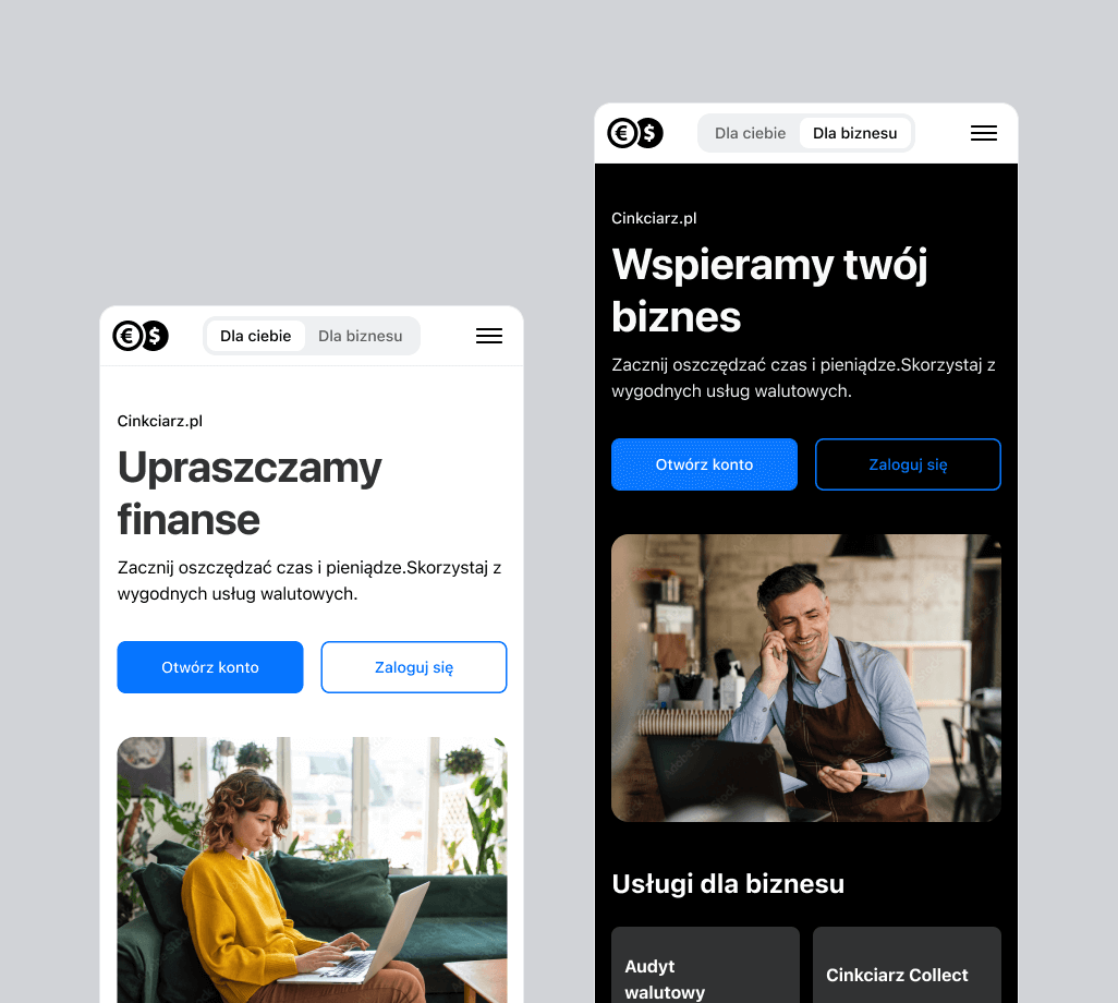
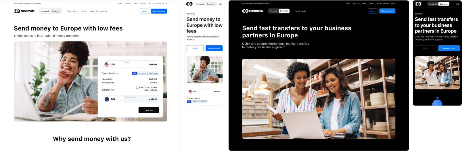
During the second and third rounds, we made major improvements to the layout, information architecture, and submenu logic. Key usability issues were addressed — including context switching, image scaling, and visual clarity. We refined the segmented control, adjusted visuals for better accessibility and tone, and introduced dark mode. Based on feedback, we also swapped hero images to better reflect target groups. These changes, along with UI polish and better micro-interactions, raised the SUS score from 73 to 85.
After the RITE testing, we conducted contextual interviews with respondents. The overall design and prototype remained nearly unchanged, with only minor tweaks to icons and smoother interactions added. The final prototype felt refined and stable – and the SUS score rose to an impressive 93 points!

This phase not only wrapped up the current project but also laid a solid foundation for ongoing iteration and product improvement based on actual user needs.
04 Deliver
In the Delivery phase, we focused on refining and handing off the final solutions to developers and other stakeholders.
I organized and updated the design system with tested UI components like adjusted buttons, service tiles, and improved submenu behavior. Detailed documentation was added to cover interactions, dark mode behavior, responsiveness, and updated visuals.
The final prototypes in Figma were interactive, clean, and optimized for performance and accessibility.
This setup ensured a smooth transition from design to development—with clear guidance, a consistent visual language, and fewer back-and-forth questions during implementation.
Implementation
After launching the new navigation, the process shifted into continuous discovery. We rolled out the updated experience on the U.S. instance first, which allowed us to closely track how users navigate, switch between contexts, and where key conversions happen. With support from developers, we monitored real behavior using tools like Google Analytics and live sessions – testing, tweaking, and improving based on what we saw in action.
Summary and conclusions
The redesign of Cinkciarz’s marketing site focused on improving usability, updating visual design, and clarifying the information architecture to better reflect the company’s broad portfolio of services for both individual and business users.
Design & UX/UI Strategy
- Audited the current user experience using heuristics, Google Analytics data, and session recordings.
- Conducted user interviews and synthesized insights into key pain points and design hypotheses.
- Reworked the navigation and information architecture to reduce cognitive load and support task-based exploration.
- Designed modular UI components aligned with the existing design system, with support for dark mode and responsive behavior.
- Iteratively tested prototypes through RITE sessions and usability testing, increasing the System Usability Score (SUS) from 73 to 93.
Implementation & Business Impact
- Simplified and clarified the main navigation, making services easier to find and understand.
- Added contextual segmentation, allowing users to quickly switch between individual and business perspectives.
- Modernized the visual design, creating a more trustworthy and approachable impression.
- Improved UX consistency across screens and interactions, reducing friction in service discovery.
Team & Process
- Collaborated in a cross-functional team including designers, researchers, product managers, developers, and stakeholders from marketing and operations.
- Stakeholders from different departments joined the testing process, enabling alignment across teams and real-time feedback.
- Improvements were based on prioritization using severity labels from earlier research insights (e.g., frustration, confusion, overwhelm).
Benefits for end users
- Easier access to relevant services based on user context (business or individual).
- Improved navigation logic and labeling reduced time spent on finding information.
- Clearer visual hierarchy and improved content layout supported better decision-making and reduced confusion.
- Enhanced accessibility through better contrast, bigger tap areas, and more intuitive behavior across breakpoints.
What we learned?
- Even small changes to architecture and component behavior can significantly improve the user experience.
- Early insights from usability research helped guide effective design decisions.
- Involving users and stakeholders throughout the process builds trust and ensures that improvements are both user-centered and aligned with business needs.
- Prototypes should be iteratively tested and refined – what worked on paper needed real feedback to shine in practice.