Cinkciarz – my journey

From a Currency Exchange Website to a Fintech Powerhouse
Growth stage
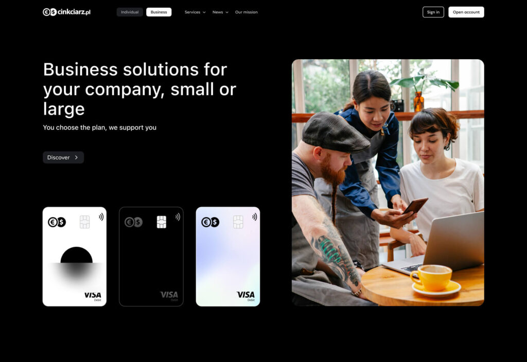
B2C / B2B
Company size
250+
Industry
Finance / Fintech
Market
Mainly Poland 80%
(partly US, Germany, other)
Product
Mobile App, Web App, WWW
From a Currency Exchange Website to a Fintech Powerhouse
Growth stage
B2C / B2B
Company size
250+
Industry
Finance / Fintech
Market
Mainly Poland 80%
(partly US, Germany, other)
Product
Mobile App, Web App, WWW
Long story short
Cinkciarz.pl started its journey in 2010 as a simple yet groundbreaking idea: to make currency exchange easier, cheaper, and accessible online.
Back then, most people had to rely on traditional methods to exchange money—slow, expensive, and far from user-friendly. Cinkciarz stepped in and revolutionized the game, offering competitive rates and a seamless online experience.
In 2014 launched its first mobile app, making currency exchange and financial management as simple as a tap on your phone. Most of its users are still based in Poland, although the company has been growing its presence abroad in recent years.
How it started
My role during the Cinkciarz redesign

When I joined Cinkciarz.pl, I stepped into a dynamic environment full of challenges and opportunities.
My primary focus was to lead the visual refresh of all the company’s products, ensuring a cohesive, modern, and user-centered design across the board.
This was no small task, as it involved not just redesigning interfaces but rethinking how we approach design as a team.
Problem
Cinkciarz needed consistency across platforms, visuals, and communication.
Over time, Cinkciarz built several products — each with different logic, visuals, and tone. This led to a fragmented experience and a lack of brand consistency.
The website was overloaded with content, tools looked and worked differently, and the language wasn’t unified. Key flows were inconsistent, the structure was confusing, and users often got lost.
The platform became difficult to use and even harder to maintain – both for users and internal teams.
Goal
Unified foundation to scale smarter and deliver a consistent experience.
To fix the fragmented ecosystem, we had to go back to the basics. Thanks to early discovery sessions, research, and close collaboration with the internal team, we quickly defined what needed to change — and how.
The focus was on long-term structure, not short-term fixes. That meant:
- Simplifying internal workflows to speed up implementation and reduce errors
- Building a flexible, scalable design system from scratch
- Aligning the experience across web and mobile
- Improving the logic behind processes and navigation
- Creating documentation and guidelines for future growth
Design process
Discovery
I audited the existing products, reviewed research insights, and evaluated the current design system.
I also took a deep dive into the business requirements to understand the strategic goals behind the platform.
Desk research • Audit UX / UI Competitors Analysis • Hypothesis • DS audit
Define
We turned discovery insights into clear priorities, uncovering key pain points like confusing flows, visual inconsistencies, and unclear messaging. This helped us define focus areas and shape a unified product vision.
Research insight syntesis • Issue table • Mind map • Mood board
Develop
We explored early concepts and built low-fi prototypes.
Mapping customer journeys and analyzing feedback helped us shape a clearer structure and lay the groundwork for the new design system based on new communication strategy.
Concepts / prototypes • Customer journey • Reports • Research synthesis • new DS structure • Communication strategy
Deliver
In this final stage, we wrapped up research findings into clear documentation and refined UI components.
We expanded the design system with reusable templates and patterns, making it easier for teams to implement updates consistently across products.
Data synthesis • Documentation • Design system • Handoff materials
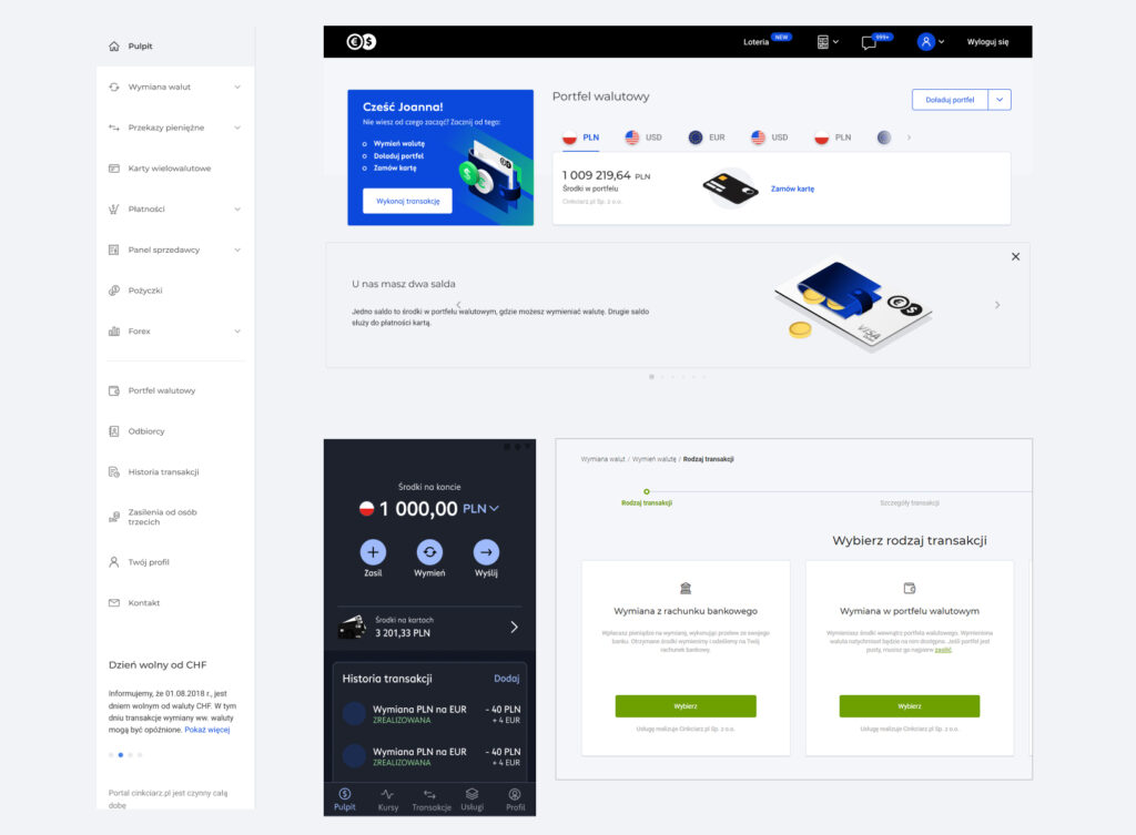
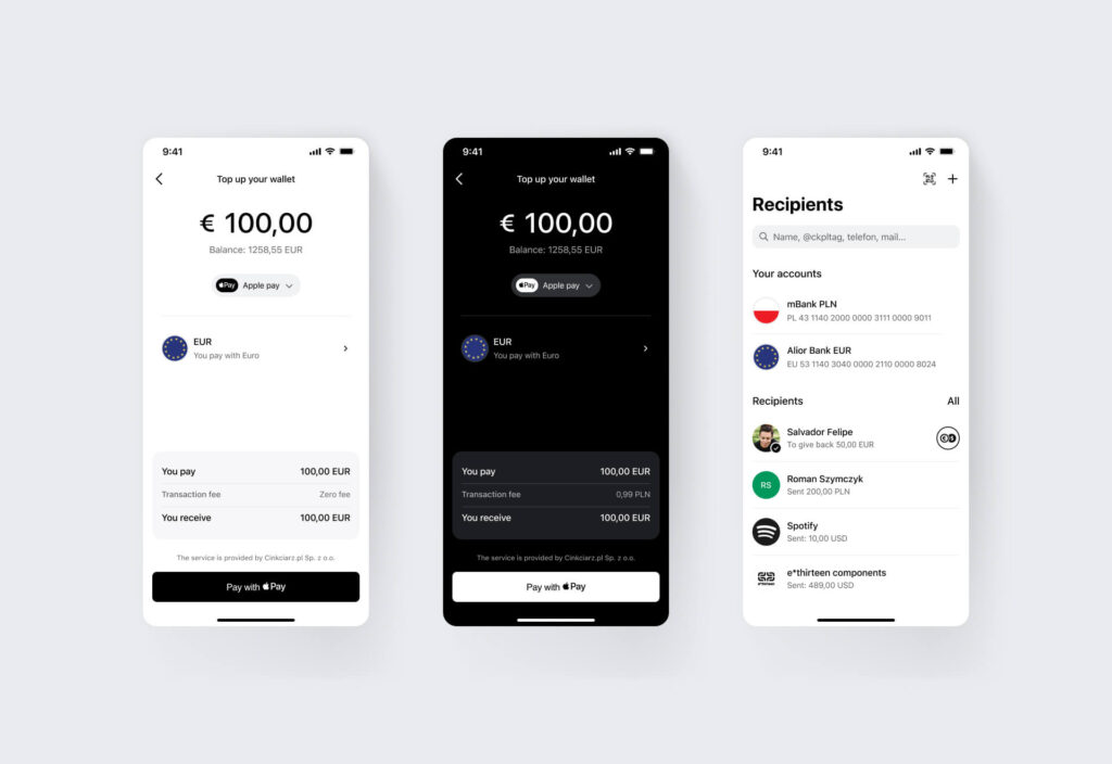
Previous interface
The audit revealed a number of inconsistencies across visual design, responsive behavior, typography, and copy. These issues were affecting both the user experience and the overall perception of the brand. The findings helped build a strong case for introducing a unified design system and setting new design standards.
New approach
We set a new design direction by formulating clear hypotheses about user experience and visual consistency. This allowed us to test different approaches and select those that best met our users’ needs while maintaining a modern and cohesive look throughout the app.
Instead of excluding we support
For everyone
Our new communication strategy? It’s all about being the everyman – approachable, relatable, and here for everyone. No fancy jargon, just clear, honest messaging that feels like chatting with a friend. It ties everything together, from the way we write copy to how our products look and feel. Instead of being exclusive, we’re all about support, making sure everyone feels included and at ease.

Most people still saw Cinkciarz as just a currency exchange service, not as a broader fintech product – how to change that?
During the discovery phase at Cinkciarz, we kicked off with desk research to understand how users see our brand and what they actually know about our products. We analyzed user feedback, support tickets – what we found was pretty telling – many users didn’t realize we offered things like payment cards.
To understand how we stack up, we looked at competitors like Wise and Revolut. Their products are tightly integrated, and their communication is very consistent — everything reinforces the idea that they’re modern, digital-first finance solutions.

In Poland, Cinkciarz is still perceived as a reliable, local brand – which came up repeatedly in our feedback. That trust is a huge competitive advantage. So we saw a real opportunity: to shift the brand perception from 'trusted currency exchange’ to 'trusted Polish fintech’.

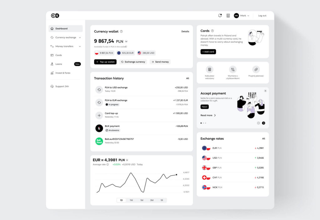
Design system
Design System Piano
The „Piano” design system was created in response to the need for a cohesive, modern, and functional vision of the user interface that is both elegant and intuitive.
We chose the name 'Piano’ intentionally, inspired by the piano keyboard – its black and white keys represent rhythm, harmony, and something that feels universal. These ideas became the foundation of the project, which was all about refreshing and unifying Cinkciarz’s visual identity in a more modern and cohesive way.


Token-powered design handoffs: where pixels meet code with less drama and more precision!
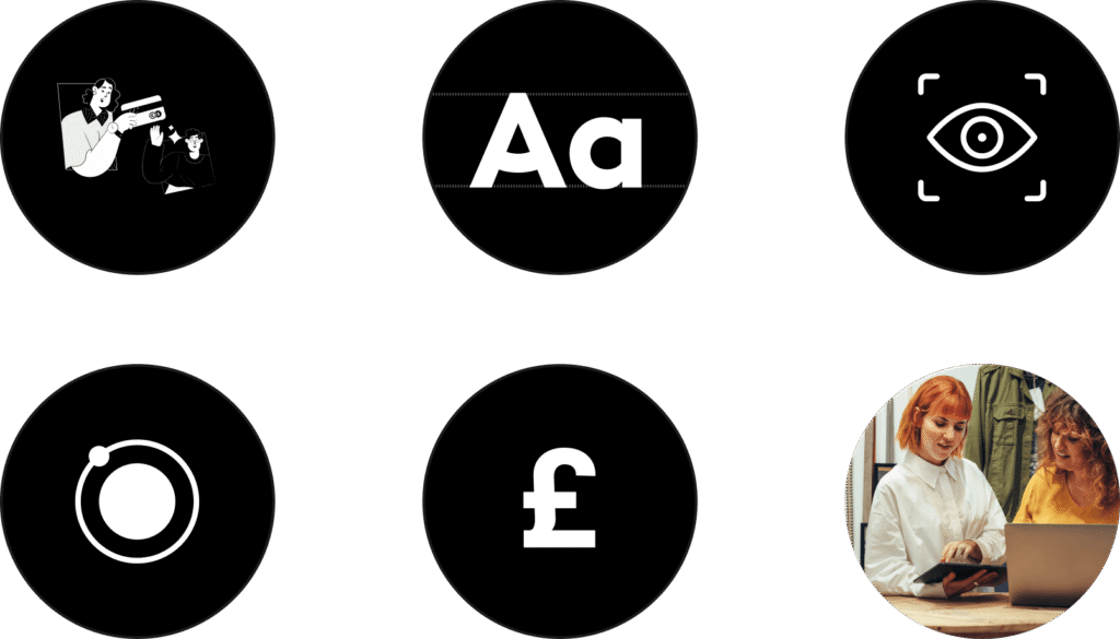
Atomic Design simplifies project handoff to developers by breaking down designs into reusable components like atoms, molecules, and organisms. Leveraging design tokens in Figma streamlines this process by ensuring consistent styling and easy updates across projects, making collaboration smoother and more efficient.

When building our design system, the principle „Instead of excluding, we support” guided us throughout. Our goal was to ensure that our products remain accessible to everyone, fostering inclusivity and usability across all platforms and user needs.
It’s the A-TEAM!
Even if you have a vision and a lot of experience, it means nothing without a team that supports you.


Summary and conclusions
The Cinkciarz case was a strategic redesign initiative aimed at redefining how users perceive and interact with one of Poland’s most recognizable fintech brands. The goal was to evolve the product from a currency exchange platform into a comprehensive, trusted digital finance solution.
Design & UX/UI Strategy
- Conducted desk research and to uncover perception gaps – many users didn’t fully understand the offer or know that Cinkciarz provides payment cards.
- Created user personas and journey maps to address the needs of different user types (e.g. individual clients, small businesses).
- Set a new design direction based on hypotheses around user experience and brand perception.
- Built a consistent design system rooted in modular components and atomic design principles.
- Collaborated across departments to align business goals with UX decisions.
- Ensured responsiveness and consistency across web and mobile platforms.
Implementation & Business Impact
- Repositioned Cinkciarz from a „currency exchange tool” to a full-fledged Polish fintech platform.
- Clearer UI and improved navigation helped users better understand available services, including payment cards.
- The design system enabled faster rollout of new features and ensured visual and functional consistency across the ecosystem.
- Improved onboarding and daily usage flows reduced cognitive load and time spent on key tasks.
- Built a scalable, modular interface that supports rapid adaptation to changing business needs and user expectations.
Team & Process
- Worked in a cross-functional team (UX, Research, PM, Dev, Marketing, Big Data).
- Maintained ongoing feedback loops with stakeholders to align on priorities and validate hypotheses.
- Integrated feedback from internal and external users through continuous testing and iteration.
Benefits for end users
- Intuitive navigation and clearer structure improved access to key services.
- Users became more aware of the full product offering and could use more features without support.
- Reduced friction in key flows like card activation, currency exchange, and transaction history review.
- Visual consistency helped build trust and reinforce the brand’s credibility as a fintech player.
What we learned?
- Even established products with strong brand recognition can suffer from perception gaps. Research and validation are key to addressing them.
- A well-structured, hypothesis-driven design strategy can shift brand perception and improve product usability.
- Clear communication and alignment across design, development, and business teams is essential in delivering meaningful change.
- Trust is a major advantage, but to remain competitive, it must be paired with modern UX and clear messaging.