Language House
Learn with joy, Grow with confidence.
Growth stage
B2C
Company size
20
Industry
Education
Market
Poland
Product
WWW
Learn with joy, Grow with confidence.
Growth stage
B2C
Company size
20
Industry
Education
Market
Poland
Product
WWW
Long story short
Language House began its journey in 2001 with a simple yet ambitious mission: to make learning foreign languages easier and more enjoyable for children, teenagers, and adults in Kielce.
At a time when language learning often meant boring textbooks and rigid lessons, Language House introduced a fresh approach – combining practical use, fun, and personalized teaching. This quickly earned the trust of the local community.
Over the years, Language House has grown to offer exam prep courses, business language training, and classes with native speakers. Its kid-friendly programs, like Teddy Eddie, make learning fun and engaging.
Today, the school operates in two Kielce locations and, with over 20 years of experience, is known as one of the region’s top language schools.
Problem
Language House needed a brand identity that reflected its modern, student-centered approach to teaching.
Despite being a well-established language school with a loyal student base, its visual identity felt outdated and inconsistent across platforms. The logo, color palette, typography, and messaging didn’t capture the joyful, confidence-building atmosphere that defined the actual learning experience.
There was also a mismatch between how the brand was perceived and how it wanted to be seen — as a modern, progressive place rooted in positive education, not just another traditional school.
Goal
The goal was to design a visual and strategic foundation that would support the brand’s continued growth.
Create a new visual identity system that would be consistent with the school’s mission and its emotional tone: friendly, supportive and full of positive energy.
The focus was on long-term structure, not short-term fixes. That meant:
- Defining a new direction for the brand, centered around joy, energy, and trust
- Running a brand and visual audit to identify inconsistencies in color, typography, layout, and tone
- Designing a flexible identity system that works across digital and print, from the website to classroom posters
- Establishing a color palette and typography that feels both playful and professional
- Crafting messaging principles rooted in positive language and empowerment
- Creating clear guidelines to help the team implement the new identity consistently over time
My role
Turning ideas and feedback into easy, enjoyable experiences people love to use.

I collaborated closely with the marketing team, who were responsible for conducting surveys among the school’s clients and developing the brand archetype. I also worked with the illustrator who created the new logo.
My primary focus was to lead the visual refresh of all the company’s products, ensuring a cohesive, modern, and user-centered design across the board.
This was no small task, as it involved not just redesigning interfaces but rethinking how we approach design as a team.
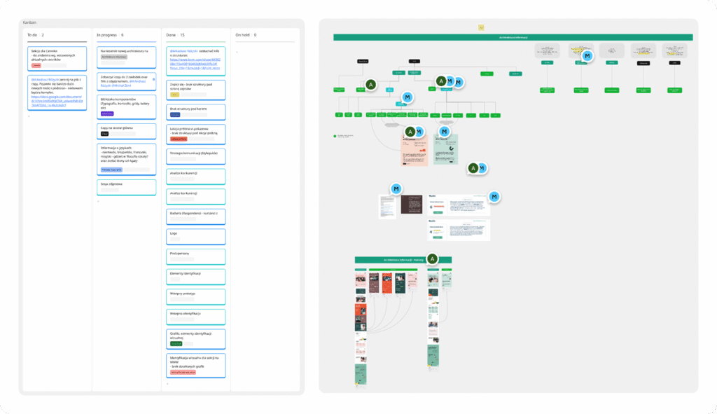
Design process
Discovery
I started by auditing the existing brand materials, website, and communication channels. I also reviewed client survey insights gathered by the marketing team and analyzed competitors in the education space. This helped identify key gaps in consistency, accessibility, and overall brand perception.
Brand audit • UX/UI review • Competitor analysis • Desk research • Voice & tone review
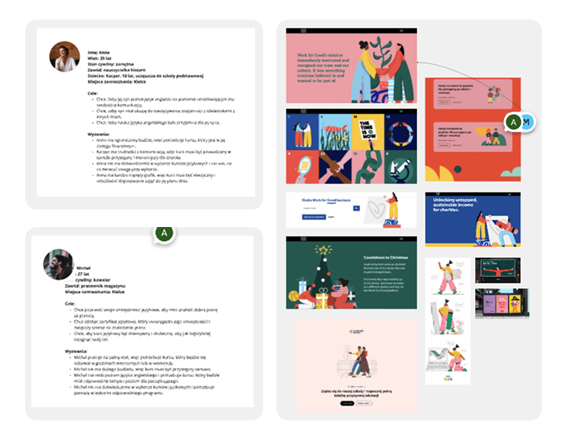
Define
Based on the findings, I identified the most urgent pain points – outdated visuals, inconsistent messaging, and a lack of emotional connection. Based on the brand archetype provided by the marketing team, I developed user personas and defined the key emotional drivers behind user engagement.
Persona creation • Insight synthesis • Workshops • Moodboard
Develop
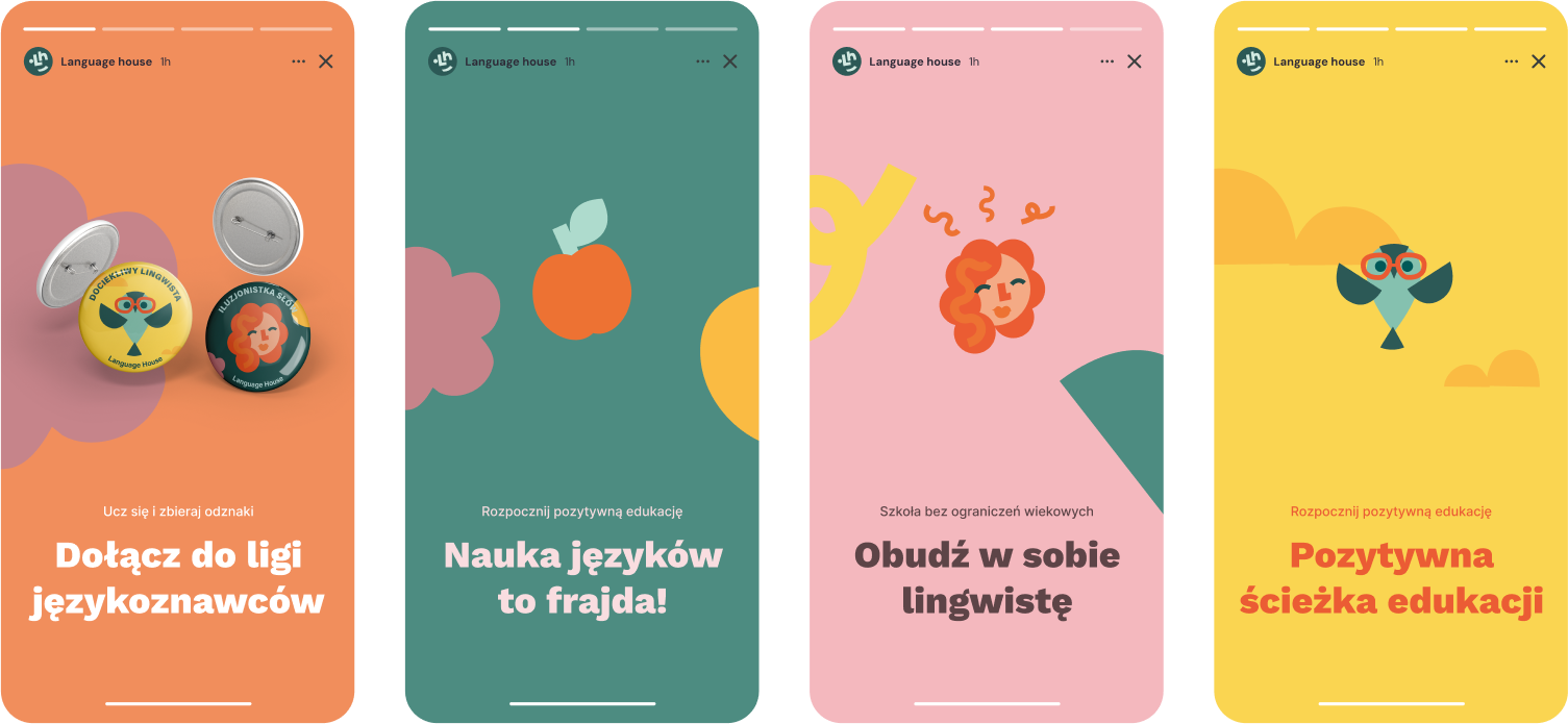
I began exploring visual directions and building out the brand’s key visuals. Using the new voice and tone as a guide, I designed the first components of the design system, including typography, colors, layout rules. This stage also included close collaboration with the illustrator on logo integration and brand expression.
Visual concepts • Key visuals • Design system foundation • Workshops • Iterative feedback
Deliver
In the final phase, I expanded the visual identity into a flexible system: templates, patterns, and brand rules that could be applied across web, print, and social media. I prepared clear documentation and handoff materials, ensuring a smooth implementation by the internal team and external partners.
Design system • Documentation • Handoff files • Implementation guidelines
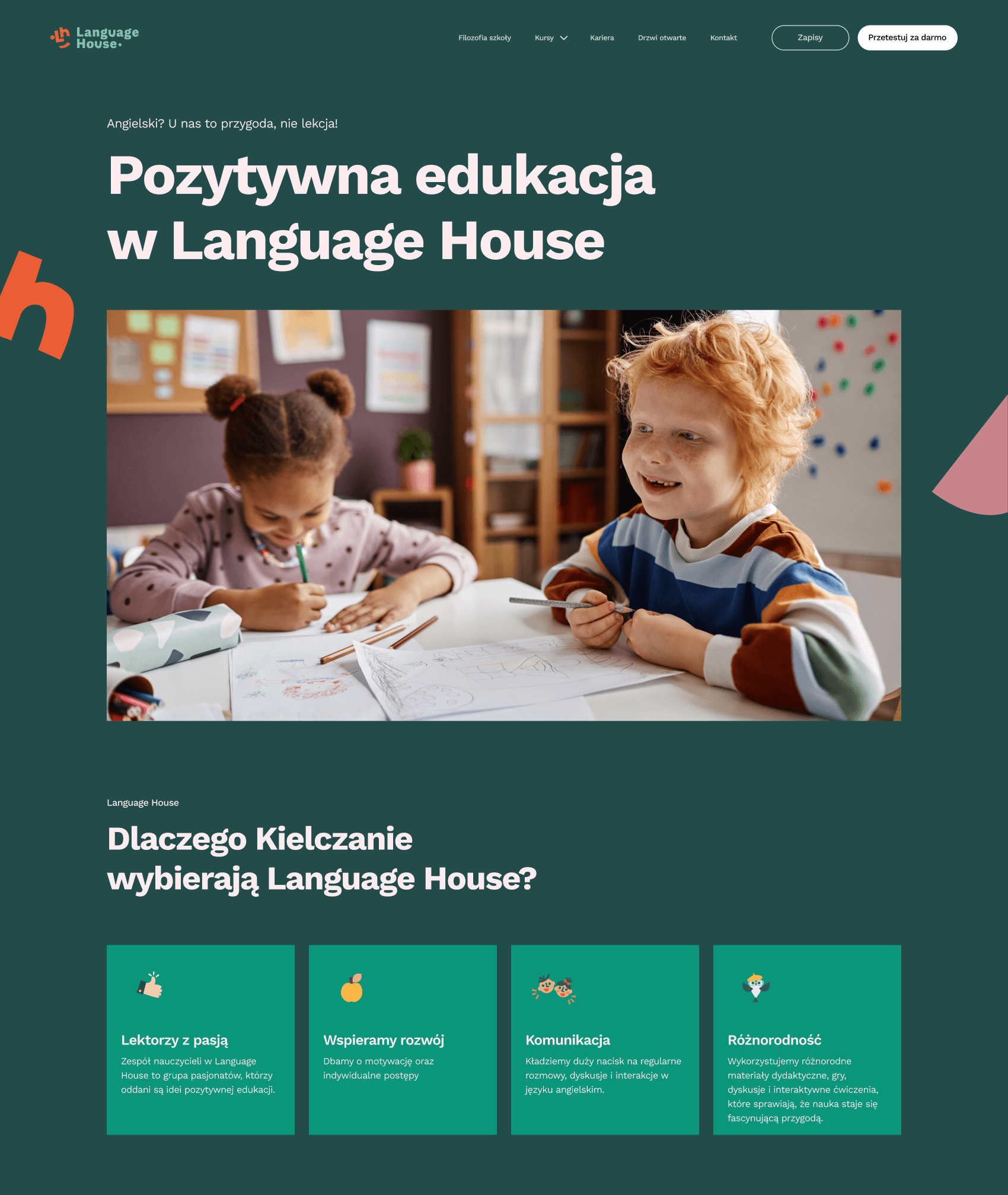
Previous interface
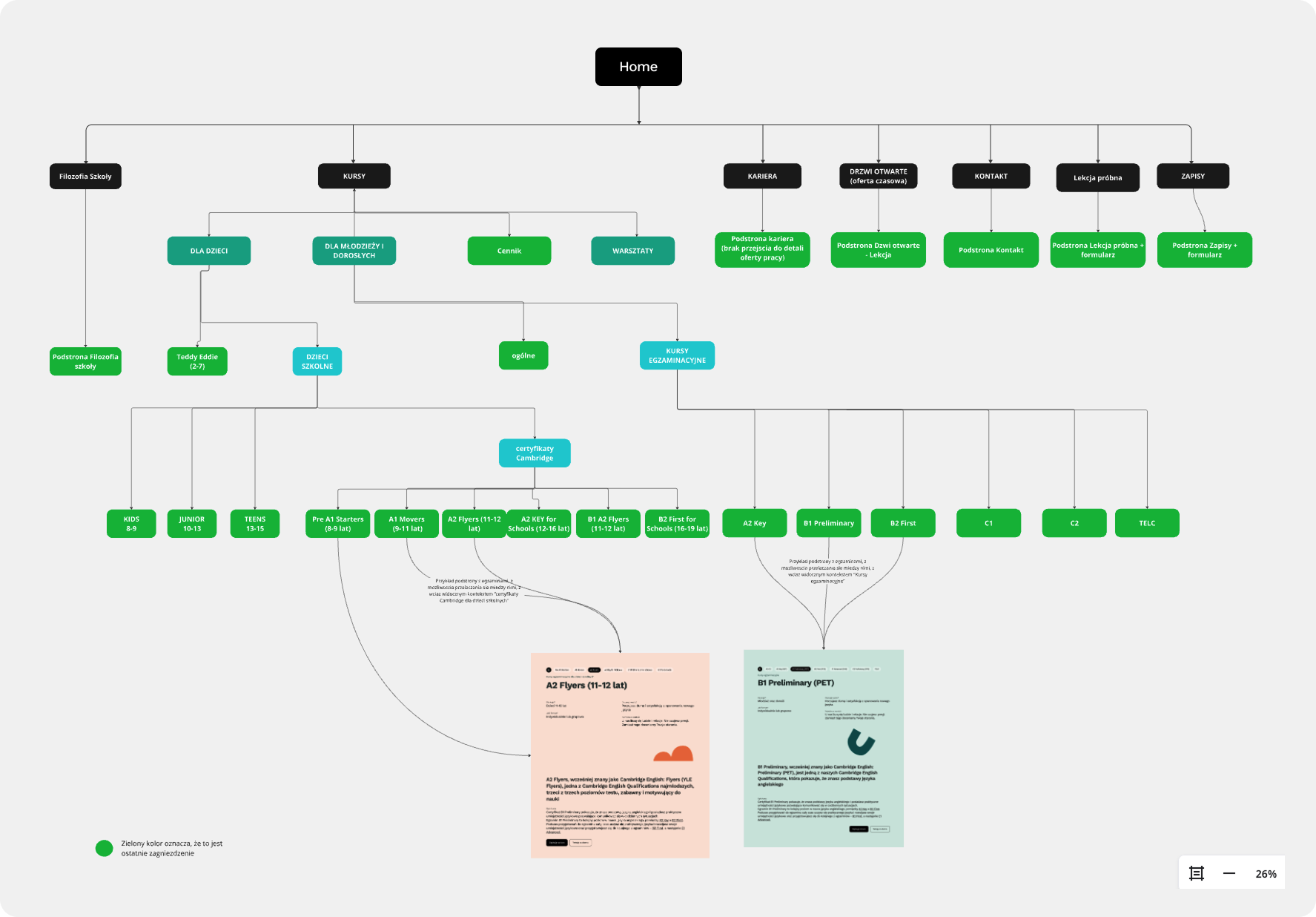
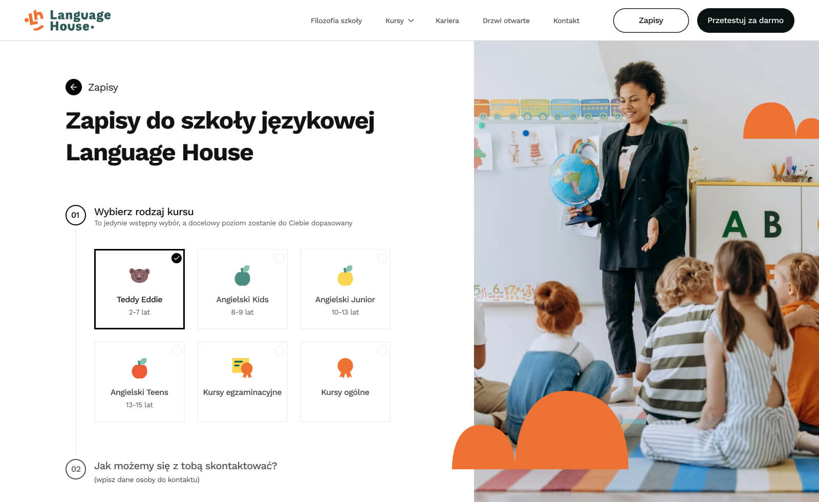
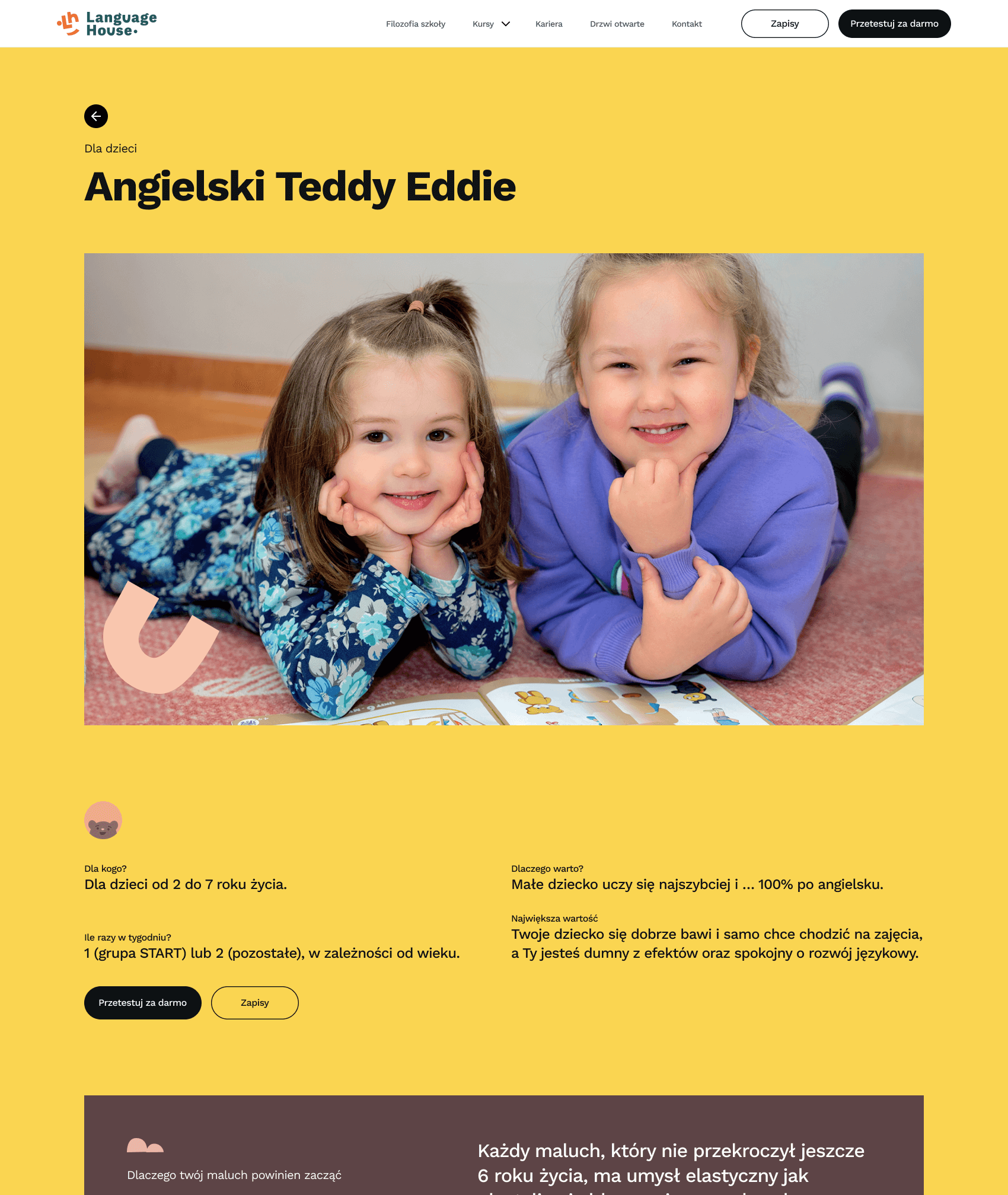
The audit revealed a range of issues across the website – from inconsistent visual design and typography to poor responsive behavior. There were also critical problems with information architecture: the structure was unclear, course descriptions were too long, and it was difficult for users to determine which language level or group was right for them.
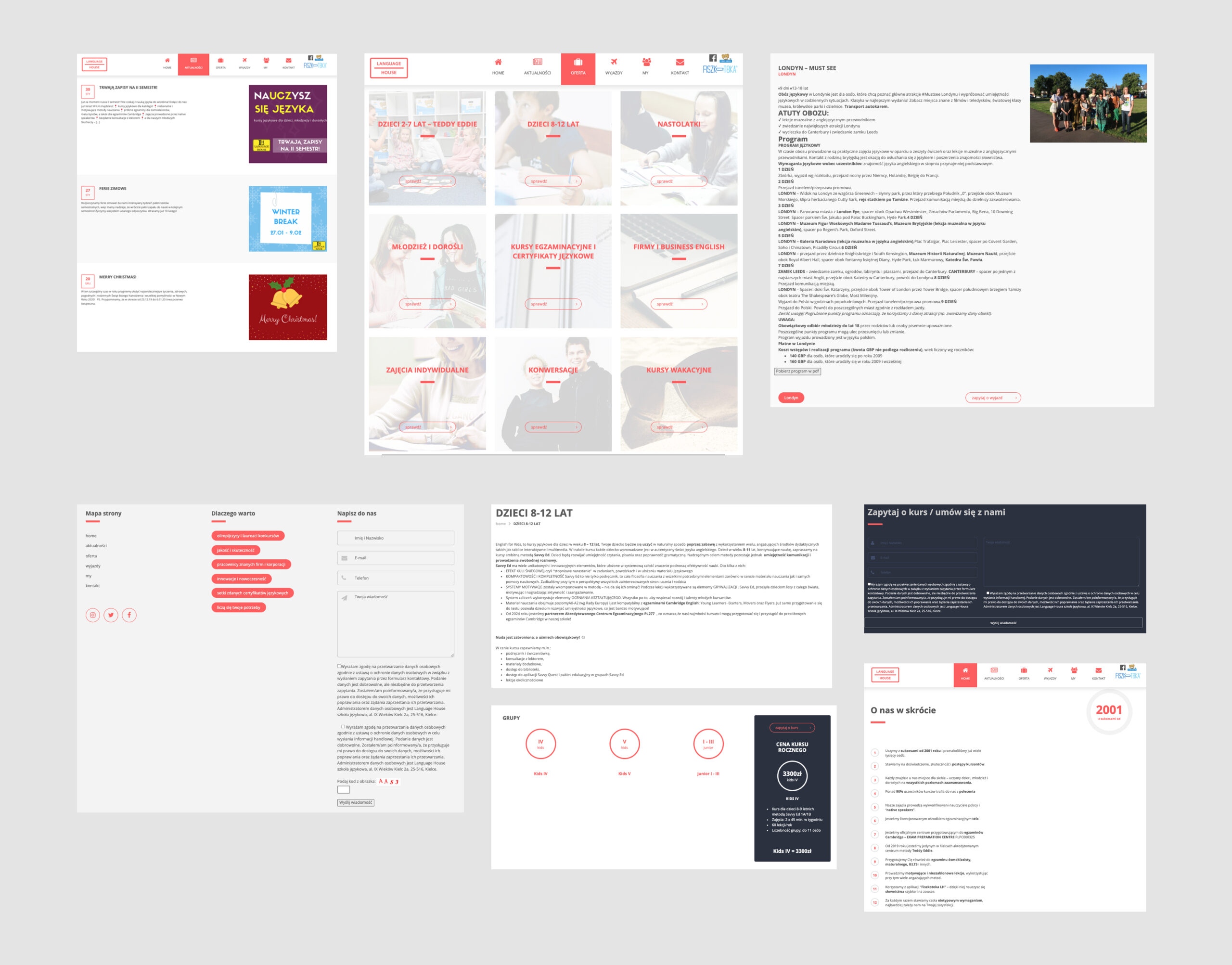
New approach
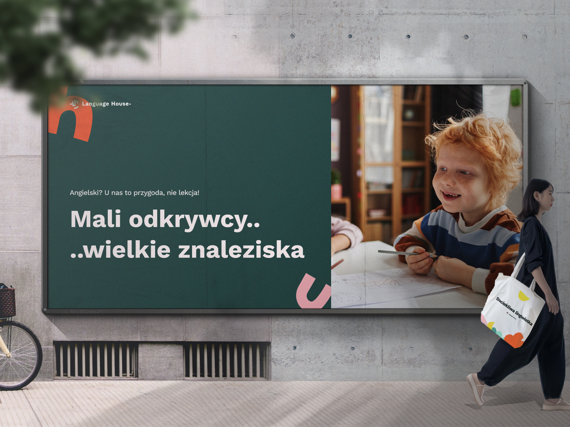
A new design direction was adopted, based on the brand archetype and hypotheses about user needs and communication style. Various visual and structural concepts were tested, resulting in solutions that best reflect the school’s character – combining a friendly tone with clear structure.
New communication strategy
For every mind
At Language House, we believe language learning is more than grammar and vocabulary. It’s about building confidence, opening up to the world, and seeing yourself and others with greater understanding. Everyone starts from a different place – and that’s okay.
Our approach is rooted in positive education. Instead of pressure, we offer encouragement. Instead of stress, we create a sense of safety. Instead of judgment, we inspire growth. We bring professionalism, but with warmth. We’re here to help you see that learning can be meaningful – and that you already have what it takes to succeed.
Language House is a place where you can feel safe, seen, and supported. Because with the right guidance, you’re not just learning a language – you’re learning to trust yourself.
Discovery
During the Discovery, Define, and Develop phases, I was responsible for a wide range of strategic and creative tasks. I conducted a competitive analysis, gathered insights from user surveys, and reviewed Google Analytics data to understand user behavior and identify key opportunities. I also analyzed the existing information architecture to highlight usability gaps.
To establish a visual direction, I created moodboards, developed initial design concepts, and crafted a key visual system aligned with the updated logo and our new brand communication strategy.

Following this groundwork, I facilitated a collaborative workshop with the CEO, the marketing team, and our illustrator. During the session:
- I presented the moodboards, visual concepts, and key visuals to gather feedback and align the vision across departments.
- I used priority mapping to encourage input and consensus.
- I assigned role-specific tasks to each team member based on their expertise (e.g., marketing, illustration, product direction)
- Using the outcomes of those tasks, we collaboratively built a design and development roadmap that reflected shared priorities and timelines.
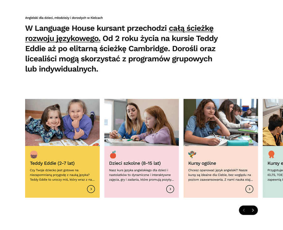
Clear structure for rich content
As part of the redesign, we created a new information architecture that helps users navigate a content-heavy site with ease. First, all content is grouped into main categories, which give the page a clear structure. Then, within each category, a submenu appears — letting users quickly dive deeper into specific topics without feeling lost.
Design system
Design system Languide
We named our design system Languide – a blend of language and guide, because it’s more than just a library of UI components. It’s a system that helps everyone on the team speak the same visual and functional language. Like a good guidebook, it shows us how to build clear, consistent, and user-friendly interfaces.
Just like spoken language, Languide has its own structure. This way of thinking helps build products that not only look good, but also make sense – visually and functionally.


Responsive, and Unified Interfaces
Thanks to DS, product views became more consistent, responsive, and visually bold. Every screen adjusts smoothly to different devices, so users always get a clear and comfortable experience.
Summary and conclusions
The Language House project was a strategic redesign focused on positioning the brand as a modern, friendly, and expert-led platform for language learners. The goal was to create a fresh visual identity and intuitive structure that reflects the company’s values: positivity, professionalism, and knowledge
Design & UX/UI Strategy
- Led the redesign as the sole Product Designer, working closely with the CEO, marketing team, developers, and an illustrator.
- Set a new visual and UX direction based on hypotheses about user needs, clarity, and brand tone
- Set a new design direction based on hypotheses around user experience and brand perception.
- Built a scalable design system using atomic design principles, enabling visual consistency and faster development.
- Designed a modular page structure and created a new information architecture to simplify navigation.
- Focused on responsive design and accessibility to ensure smooth use across devices.
Implementation & Business Impact
While the core design phase has been completed and key assets like the design system and modular UI are ready, the project is currently on hold during the search for a suitable development partner.
At the same time, the rise of AI tools and language-based technologies opened new possibilities for the business. This prompted the team to rethink parts of the product direction, which may evolve into a slightly different form than initially planned.
Team & Process
- Worked cross-functionally with marketing, CEO, and an illustrator.
- Gathered feedback regularly and iterated based on internal reviews and business priorities.
- Maintained a balance between design decisions and brand messaging.
Benefits for end users
- Improved site clarity and navigation made content more approachable.
- The refreshed look and tone increased trust and brand recognition (So far, the new brand identity has been implemented in physical and educational materials used at the school — including banners, printed learning materials, student badges, and signage. The next phase of the project will focus on bringing the new identity to digital channels, including the website and social media, ensuring full consistency across both online and offline touchpoints).
What we learned?
- Even small teams can deliver impactful design with the right focus and collaboration.
- A strong visual and structural foundation helps turn content-heavy platforms into accessible, user-friendly experiences.
- Clear hierarchy and bold design choices can make complex information easier, and more enjoyable to use.